Addendum: The Shape of Data#
The treemap project asks you to process hierarchical data, represented in files in JSON notation. However, most of the publicly available data you will find in the real world is not represented this way. You are more likely to encounter data in some “flat” tabular format, like comma-separated values (CSV) or relational database records. If you want to use the implicit hierarchical structure of that data to create treemaps or in other ways, you will need to understand the difference between the information (semantic content) represented by those flat structures and the physical data structures used to represent them. With this distinction, you can devise conversions from the data structures available to you to the data structures you need for your computational task.
Semantic content vs representation#
The same semantic content may be represented in different ways in a concrete data structure. For example, suppose we wanted a data structure to represent the data in this table conveying the income share of the richest 1% of the population in different countries in 1975 and 2022:
Country or region |
1975 |
2022 |
Absolute Change |
Relative Change |
|---|---|---|---|---|
China |
6.52% |
15.72% |
+9.20 pp |
+141% |
France |
8.20% |
12.69% |
+4.49 pp |
+55% |
United States |
10.43% |
20.87% |
+10.44 pp |
+100% |
Row-wise representation of tabular data#
We could represent this data as a list of lists by row or by column:
columns = {"region": 0, "1975": 1, "2022": 2, "Chng_Abs": 3,
"Chng_Rel": 4}
rows = [["China", .0652, .1572, .092, 1.41],
        ["France", .082, .1269, .0449, .55],
        ["United States", .1043, .2087, .1044, 1.0]]
rows[2][columns["Chng_Abs"]]
0.1044
This row-wise organization might also be represented by a file with a line for each row. The comma-separated values (CSV) format used to exchange data with spreadsheet programs is a common example.
Country or region,1975,2022,Absolute Change,Relative Change
China,6.52%,15.72%,+9.20 pp,+141%
France,8.20%,12.69%,+4.49 pp,+55%
United States,10.43%,20.87%,+10.44 pp,+100%
Column-wise representation of tabular data#
The same information could be represented column-wise:
income_distribution = {
    "Region": ["China", "France", "United States"],
    "1975": [.0652, .082, .1043],
    "2022": [.1572, .1269, .2087],
    "Chng_Abs": [.092, .0449, .1044],
    "Chng_Rel": [1.41, .55, 1.0]}
income_distribution["Chng_Abs"][2]
0.1044
Column-wise representation is common in scientific and statistical computing. It is the form used in Pandas dataframes, with each column represented as a NumPy array.
Hierarchical data#
Information is often categorized into a hierarchy. Hierarchical part-whole relations might sometimes be fixed and immutable. More often they are at least partly arbitrary and mutable conveniences. Consider, for example, the customary grouping of geographic regions into continents: Europe and Asia are sometimes considered a single continent, Eurasia, but traditionally have often been considered separate continents, with the consequence that Ankara is grouped with Bangkok and not with Athens. Statistical analyses by region may use the United Nations geoscheme, while the Internet Corporation for Assigned Names and Numbers uses a different grouping into just five major administrative regions, for example classifying American Samoa as part of North America.
One can similarly find conflicting and shifting hierarchical groupings for languages, for biological taxa, and for social and cultural groups, among many other classification systems. But as arbitrary as they may be, hierarchical grouping is often essential to making sense of the world. We may quarrel with a particular hierarchical organization, but it is hard to argue with the usefulness of hierarchical organization for data analysis.
Hierarchical part-whole relations can be represented by nesting collection data structures in Python. For example, global causes of death in 2019 could be represented by nested dictionary structures:
death_causes_2017 = {
   "Noncommunicable disease": {
         "Cardiovascular" : 0.33,
         "Cancers": 0.18,
         "Respiratory": 0.07,
         "Neurological": 0.039,
         "Digestive": 0.045,
         "Diabetes": 0.027,
         "Other noncommunicable": 0.057
         },
   "Infectious disease": {
        "Pneumonia": 0.044,
        "Diarrheal": 0.027,
        "Tuberculosis": 0.02,
        "HIV/AIDS": 0.015,
        "Malaria": 0.011,
        "Other infectious": 0.021,
        },
   "Neonatal": 0.033,
   "Maternal": 0.004,
   "Nutritional": 0.004,
   "Accidents": {
        "Transport accidents": 0.023,
        "Other accidents": 0.031
        },
   "Violence": {
        "Suicides": 0.013,
        "Homicides": 0.007,
        "Combat":  0.002,
        "Terrorism": 0.0005
   }
}
Such a structure may be represented in a file using a suitable data
exchange format such as JSON
or YAML. The Python snippet above is legal
JSON. More often, we find hierarchical data that is “flattened”
into a tabular format. For example, one free online converter from
JSON to comma-separated values (CSV) produces column headers like
Infectious disease__Pneumonia and Infectious disease__Malaria
with a single row of numerical entries. More typically we would find
one or more columns used for labels, and one or more
additional columns used for
numerical values.
In a “flat” tabular representation (e.g., a CSV file), a row may represent a path from the top-level category (e.g, “Infectious disease”) through sub-categories (e.g., “Pneumonia”), one per column, to one or more columns of numerical data. For example, consider the following hierarchy, represented in tree form:
Each path from the top of the tree to the amounts of coffee and tea consumed in a particular part of this imaginary organization (teams A1a, A1b, A2, and B) will be represented by one row in the tabular representation. Intermediate levels A and A1 may be represented on separate rows:
Division |
Subdivision |
Team |
Coffee |
Tea |
|---|---|---|---|---|
A |
||||
A1 |
||||
A1a |
13 |
24 |
||
A1b |
19 |
17 |
||
A2 |
7 |
12 |
||
B |
49 |
16 |
Alternatively, each row may contain the complete path:
Division |
Subdivision |
Team |
Coffee |
Tea |
|---|---|---|---|---|
A |
A1 |
A1a |
13 |
24 |
A |
A1 |
A1b |
19 |
17 |
A |
A2 |
7 |
12 |
|
B |
49 |
16 |
In place of empty cells, as in subdivision and team for for B above, a label may be repeated. Applying this tactic to the mortality data, I have repeated “Neonatal” and “Maternal” in the “Cause” column:
Category |
Cause |
Proportion |
|---|---|---|
Noncommunicable disease |
Cardiovascular |
0.33 |
Noncommunicable disease |
Cancers |
0.18 |
Noncommunicable disease |
Respiratory |
0.07 |
Noncommunicable disease |
Neurological |
0.039 |
Noncommunicable disease |
Digestive |
0.045 |
Noncommunicable disease |
Diabetes |
0.027 |
Noncommunicable disease |
Other |
0.057 |
Infectious disease |
Pneumonia |
0.044 |
Infectious disease |
Diarrheal |
0.027 |
Infectious disease |
Tuberculosis |
0.02 |
Infectious disease |
HIV/AIDS |
0.015 |
Infectious disease |
Malaria |
0.011 |
Infectious disease |
Other |
0.021 |
Neonatal |
Neonatal |
0.033 |
Maternal |
Maternal |
0.004 |
Nutritional |
Nutritional |
0.004 |
Accidents |
Transport accidents |
0.023 |
Accidents |
Other accidents |
0.031 |
Violence |
Suicides |
0.013 |
Violence |
Homicides |
0.007 |
Violence |
Combat |
0.002 |
Violence |
Terrorism |
0.0005 |
Indented lists#
An indented list is essentially equivalent to the flattened tabular format above, except that each label appears in a row by itself. Equivalently, one can think of an indented list as shorthand for the nested dictionary structure as written above:
Noncommunicable disease
Cardiovascular: 0.33
Cancers: 0.18
Respiratory: 0.07
Neurological: 0.039
Digestive: 0.045
Diabetes: 0.027
Other noncommunicable: 0.057
Infectious disease
Pneumonia: 0.044
Diarrheal: 0.027
Tuberculosis: 0.02
HIV/AIDS: 0.015
Malaria: 0.011
Other: 0.021
Neonatal: 0.033
Maternal: 0.004
Nutritional: 0.004
Accidents
Transport accidents: 0.023
Other accidents: 0.031
Violence
Suicides: 0.013
Homicides: 0.007
Combat: 0.002
Terrorism: 0.0005
Other representations of hierarchical data#
There are additional variations in representations that you will encounter, including some that combine multiple tables that must be combined (“joined”) to recover the hierarchy and/or a unified flat representation. It is often relatively straightforward to convert among representations of the same information, provided we make a clear distinction between the semantic content of the data and its representation.
In the treemap project, we
use only the libraries provided in a standard Python installation.
The restructure
directory provides some additional Python programs to pre-process
data and extract a hierarchical representation in JSON format.
In a typical workflow, one might clean and summarize a data set with
other tools before extracting a hierarchical representation. The
SQL language supported by most relational databases provides
operations including summarizing and combining tables. The Pandas
framework for Python includes aggregation tools. One might even
perform some data manipulation in a spreadsheet like Excel or Google
Sheets, but often it is best to fully automate a workflow so that it
can be reapplied consistently and efficiently to related or evolving
datasets.
Summary#
The same information (semantic content) may be represented with differently structured data. External sources of data (say, a spreadsheet or database) may not be organized in a way that is convenient for the specific computations we wish to perform, such as grouping and summarizing the data. Hierarchical information, in particular, is often represented in some “flat” structure (e.g., one or more tables) in which the hierarchical structure is implicit. Often it is useful to reorganize such data as a first step in using it.
Example data preparation workflow#
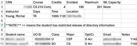
Consider, for example, the course enrollment data used in our treemap project. The primary source of this data was a class roster, with a row for each student.

The primary major code for each student was a column in that table, which was extracted to use as input in our enrollment analysis project. We summarized that table by counting occurrences of each major code and combined the summarized data with another table relating major codes like “ARCH” to full titles like “Architecture”.

While we printed the output of that project in a human-friendly format, it is a trivial change to instead produce a table in CSV or JSON format.
The grouping of majors into schools, colleges, and divisions is represented by yet another file, a JSON structure representing that structure at University of Oregon. I wrote a simple Python program to combine the structure with the counts table.
As each of these steps is automated, they form a repeatable “workflow” that can be scripted to apply quickly and consistently to class rosters in subsequent course offerings or other courses.

